Accessing the Usage Analytics
To access the usage analytics, go to the Guru’s detail page and click on the “Analytics” tab.
Usage Analytics Dashboard
The usage analytics dashboard provides a detailed overview of your Guru’s usage with comprehensive metrics and visualizations. All sections are synchronized and respond to the filters and date range you select.Date Range and Filters
At the top of the dashboard, you can select a date range using predefined options (Today, Yesterday, 7D, 30D, 3M, 6M, 12M) or choose a custom date range.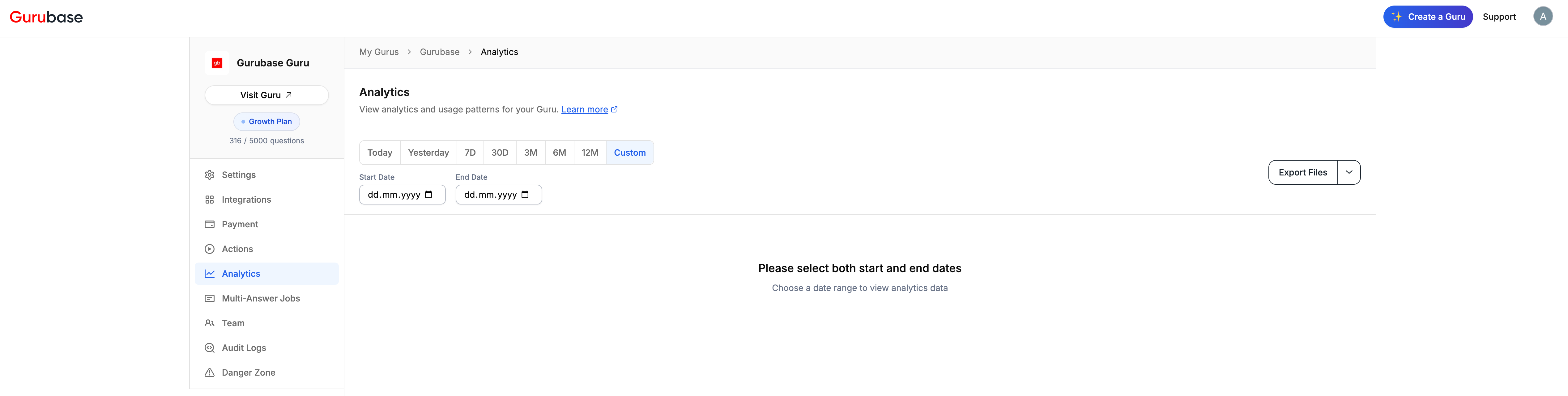
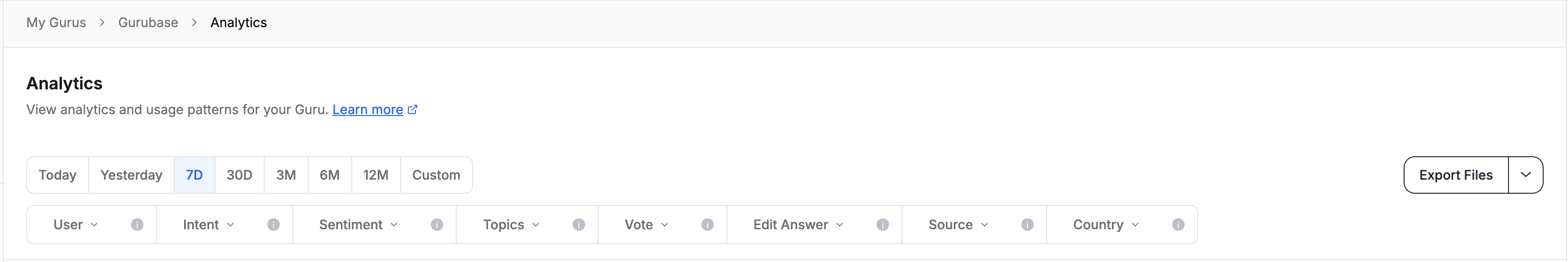
- User: Filter by specific users
- Intent: Filter by user intent. The following intent types are available:
- Short Answer: User wants a brief, concise answer
- Explanation: User wants detailed explanation of a concept
- How To: User wants step-by-step instructions
- Why: User wants to understand reasons or causes
- Comparison: User wants to compare different options
- Clarification: User needs clarification on something unclear
- Greeting: User is greeting or starting conversation
- Thanks: User is expressing gratitude
- Troubleshooting: User is trying to solve a problem
- Information Request: User wants specific information
- Other: Any other intent not covered above
- Sentiment: Filter by sentiment. The following sentiment types are available:
- Positive
- Neutral
- Negative
- Topics: Filter by topic tags
- Vote: Filter by vote status (Upvote, Downvote, No Vote)
- Edit Answer: Filter by edited answers
- Source: Filter by source type (Slack, Discord, GitHub, Widget, API, Gurubase UI, Zendesk, etc.)
- Country: Filter by country
Key Metrics
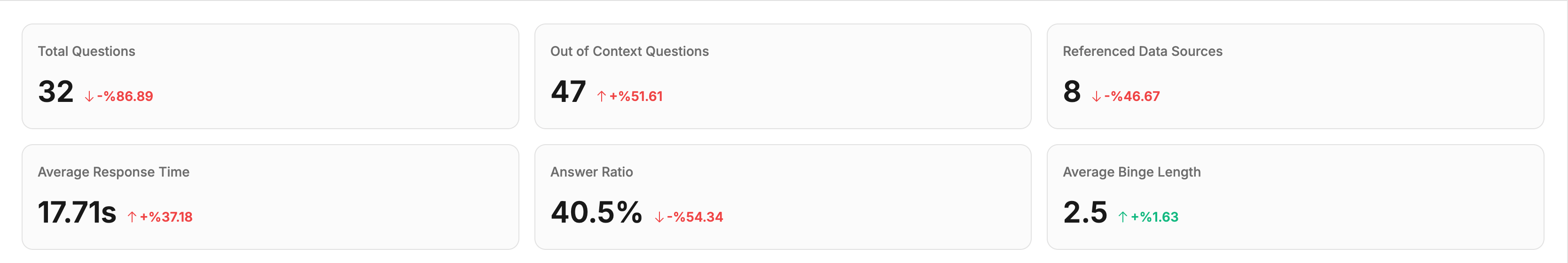
- Total Questions: Total number of questions asked
- Out of Context Questions: Questions that couldn’t be answered
- Referenced Data Sources: Number of unique data sources used
- Average Response Time: Average time taken to generate answers
- Answer Ratio: Percentage of questions that received answers
- Average Binge Length: Average number of questions per user session
Dashboard Sections
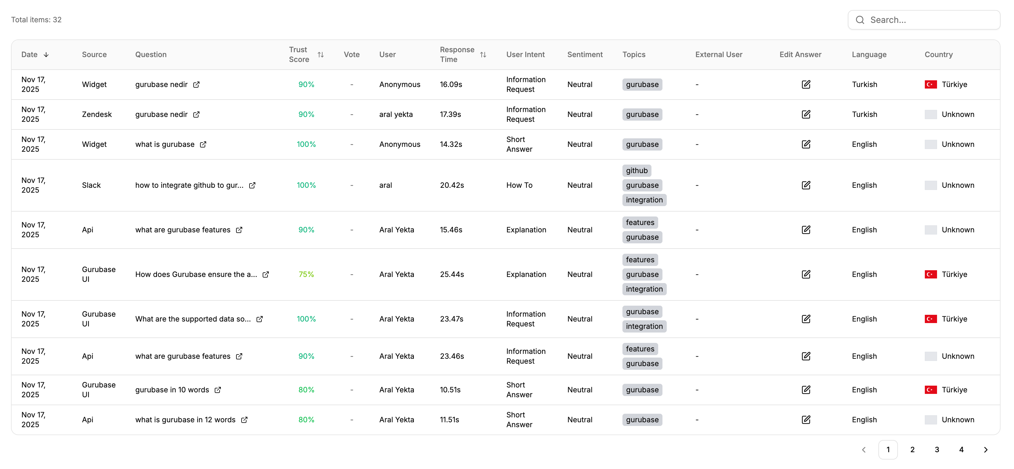
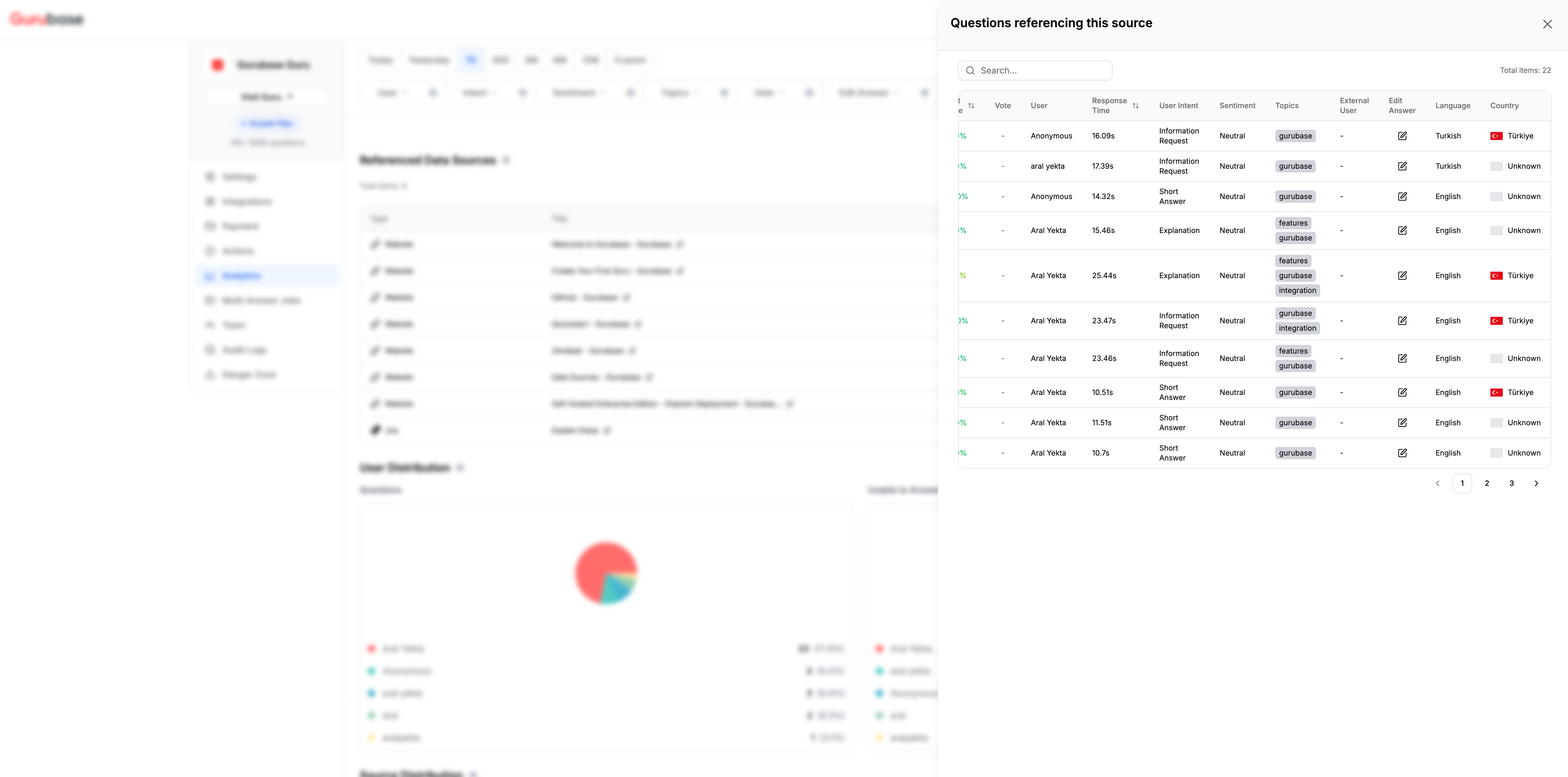
Below are the sections available in the usage analytics dashboard, organized in the order they appear:1. Questions Section
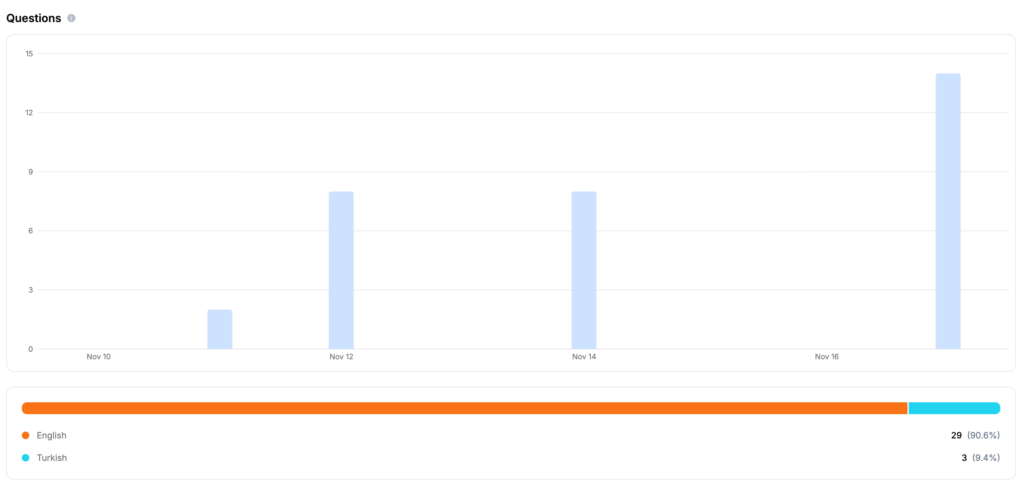
- Question text with clickable links
- Trust score (confidence level of the answer)
- Vote status (upvote, downvote, or no vote)
- User who asked the question
- Response time
- User intent classification
- Sentiment analysis
- Topics extracted from the question
- Language and country information
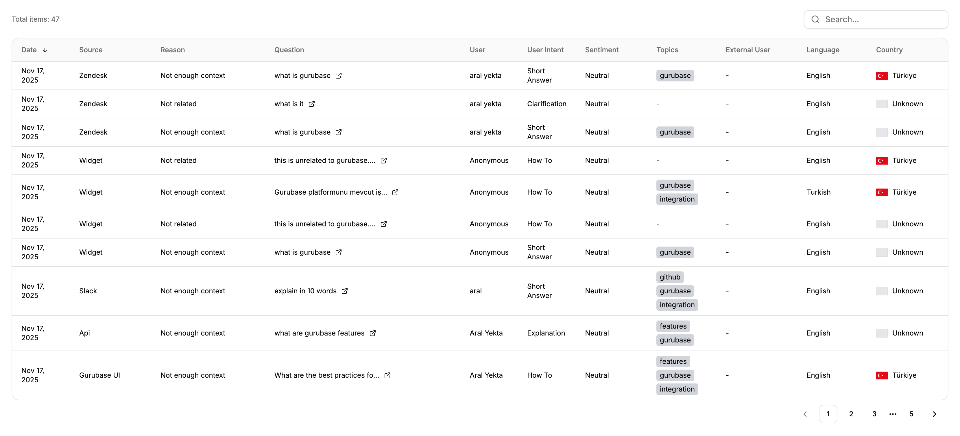
2. Unable to Answer Section
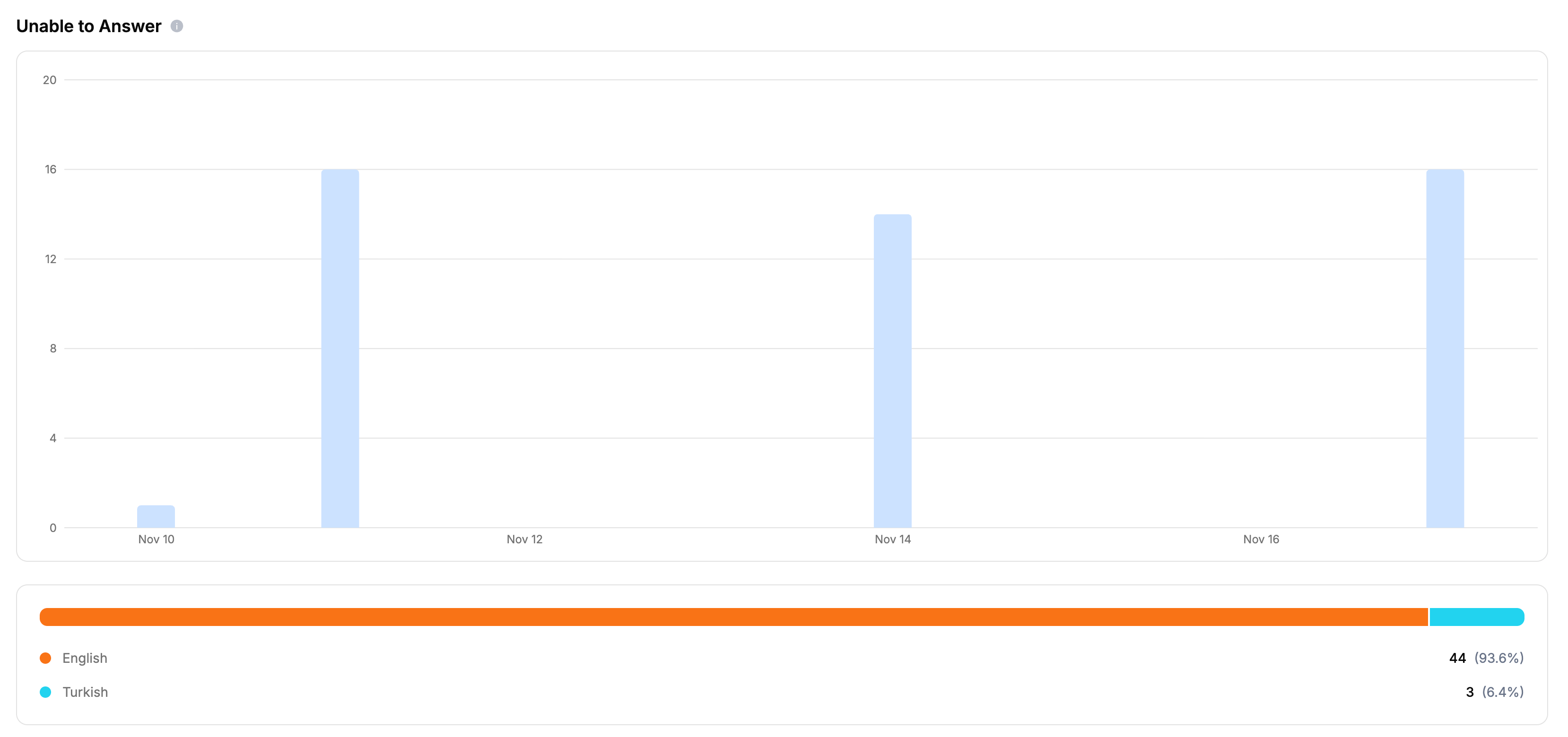
- The reason why the question couldn’t be answered (e.g., “Not enough context”, “Not related”)
- Source, user, intent, sentiment, topics, language, and country information
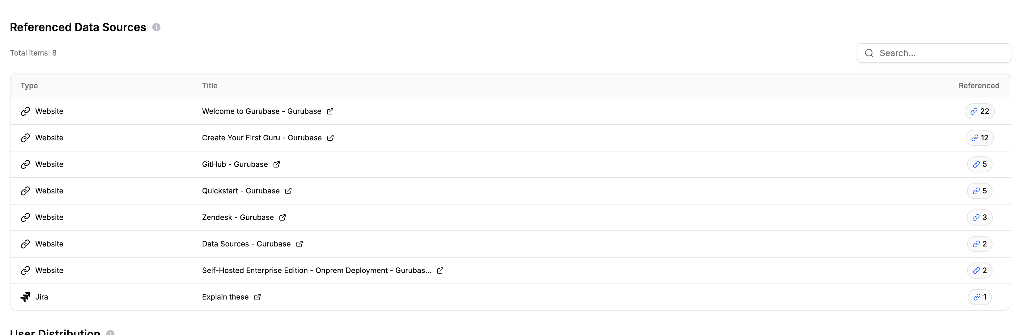
3. Referenced Data Sources Section
4. User Distribution
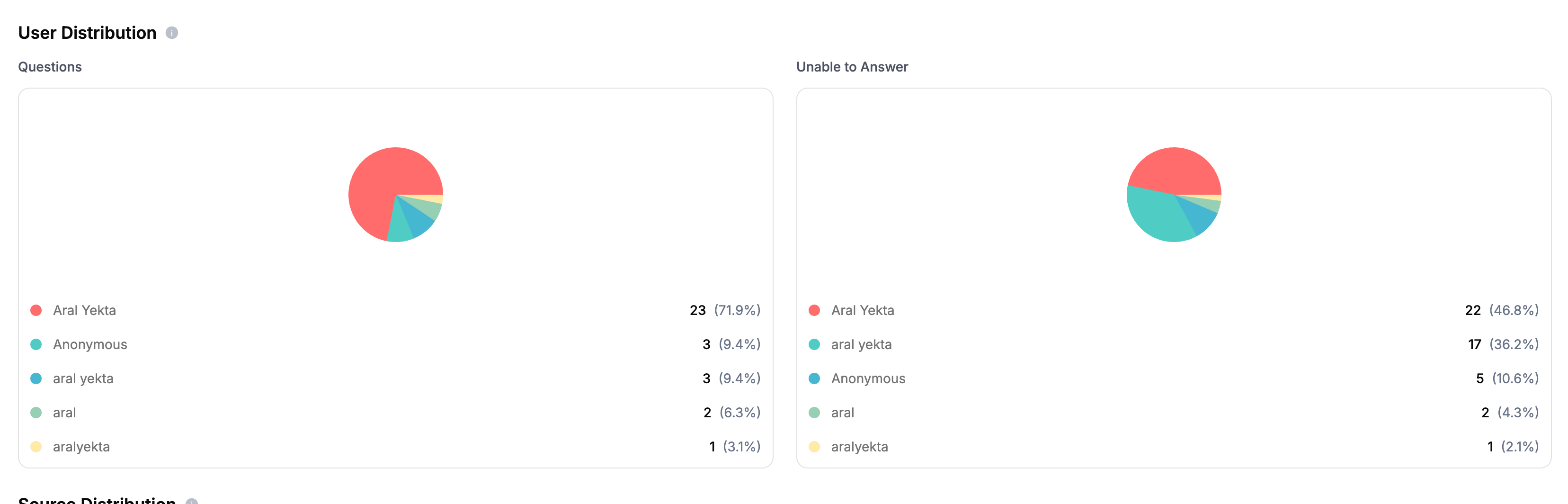
- Questions: Distribution of all questions by user
- Unable to Answer: Distribution of unanswered questions by user
5. External User Distribution
The external user distribution section mirrors User Distribution but buckets questions byexternal_user_id (set when asking via the API or widget with an external user identifier). Questions without an external user id are excluded. It displays two pie charts:
- Questions: Distribution of all questions by external user
- Unable to Answer: Distribution of unanswered questions by external user
6. Source Distribution
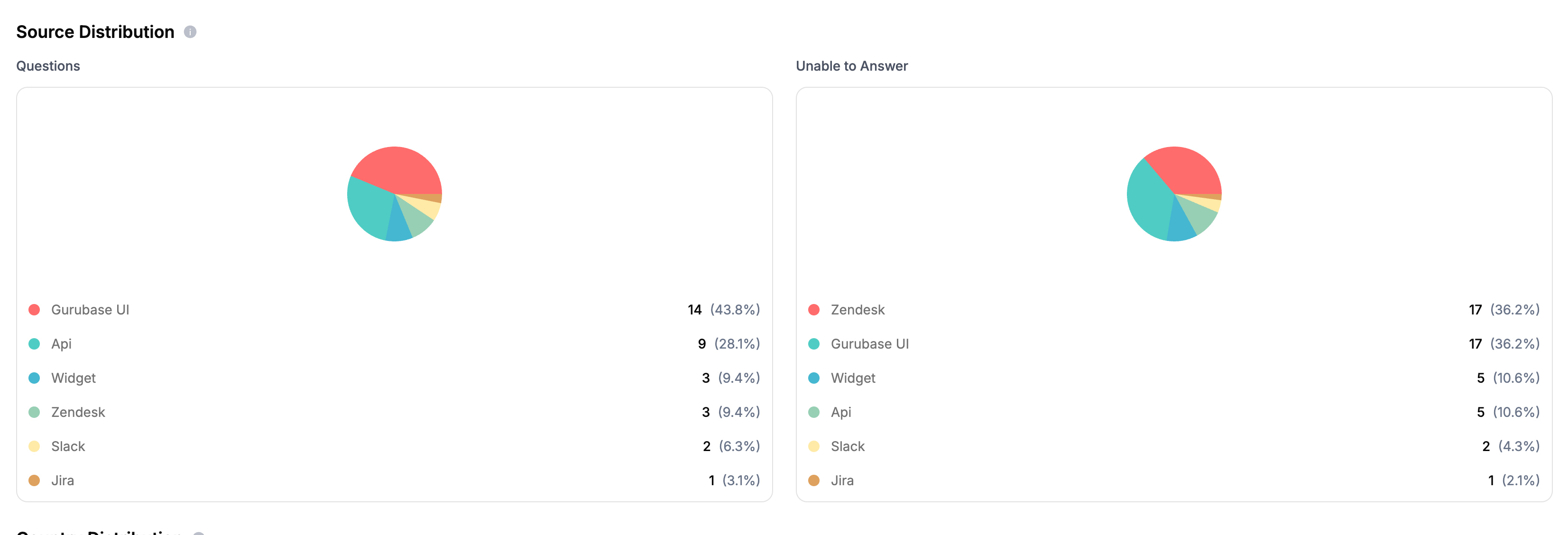
- Questions: Distribution of all questions by source (Slack, Discord, GitHub, Widget, API, Gurubase UI, Zendesk, etc.)
- Unable to Answer: Distribution of unanswered questions by source
7. Country Distribution
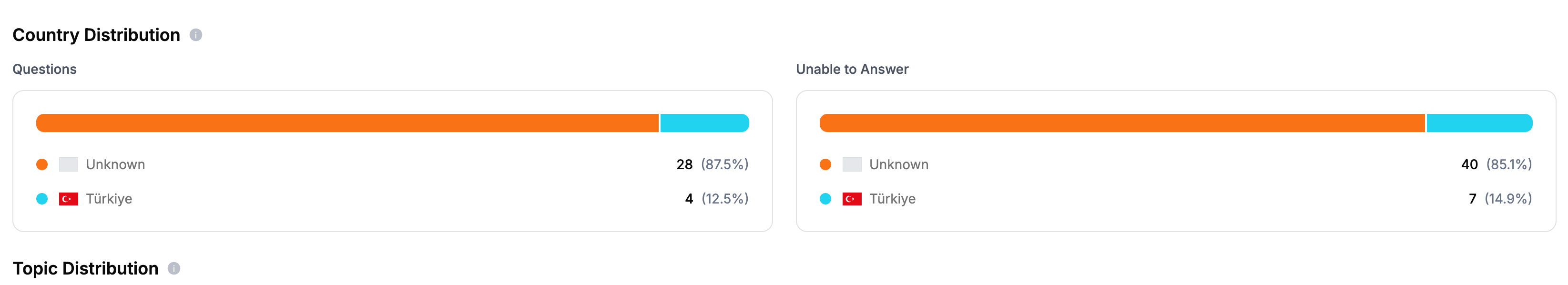
- Questions: Distribution of all questions by country
- Unable to Answer: Distribution of unanswered questions by country
8. Topic Distribution
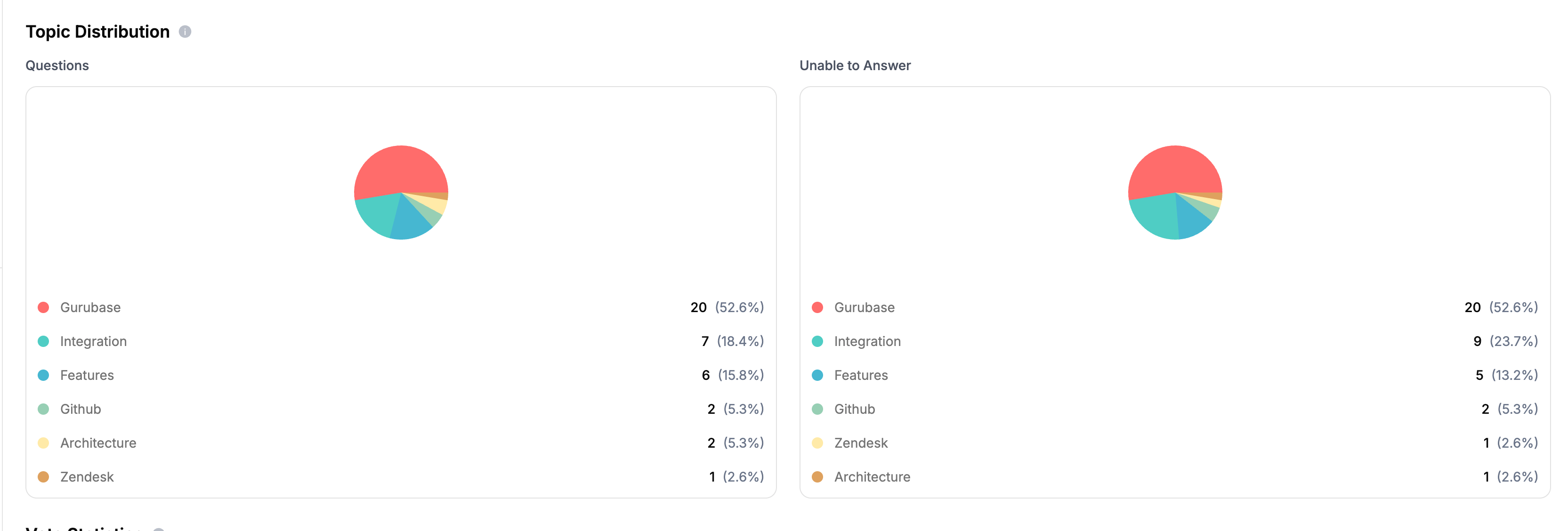
- Questions: Distribution of all questions by topic
- Unable to Answer: Distribution of unanswered questions by topic
9. Vote Statistics
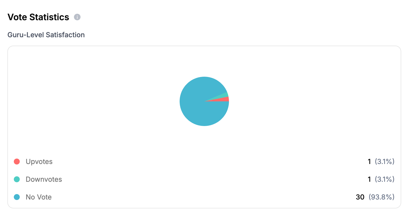
- Upvotes: Questions that received positive feedback
- Downvotes: Questions that received negative feedback
- No Vote: Questions without user feedback
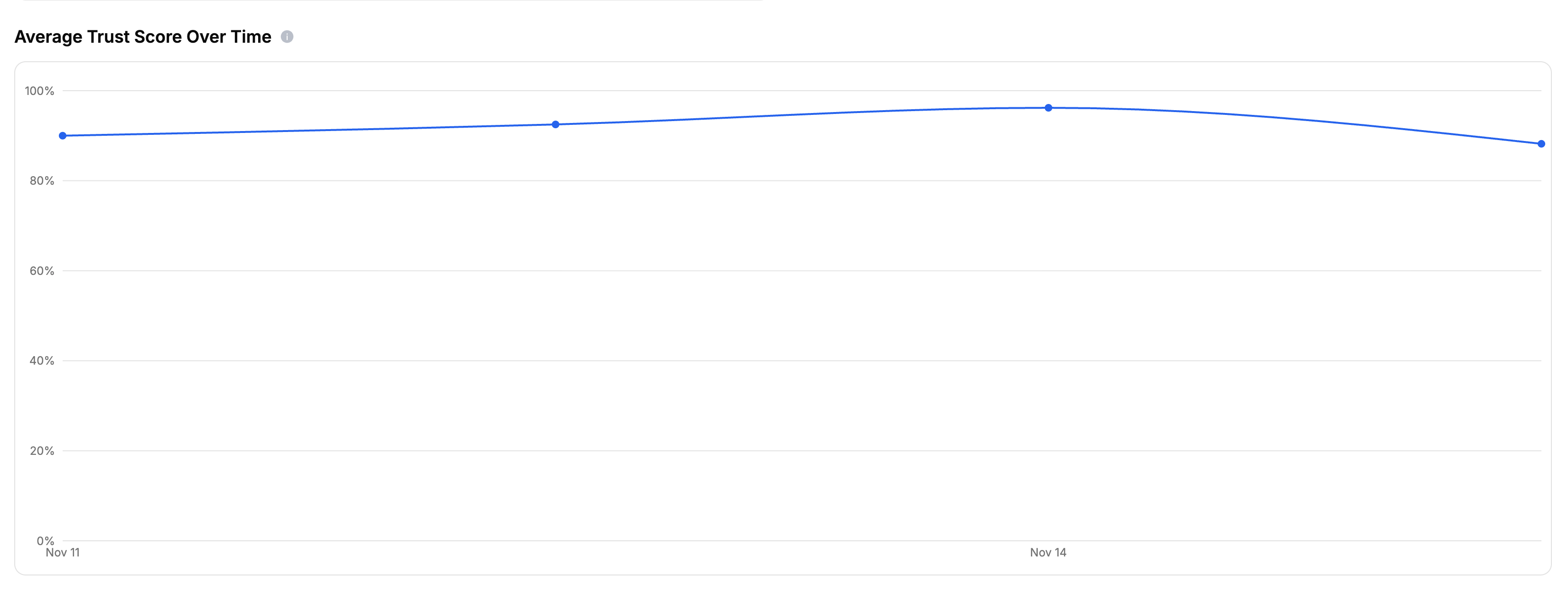
10. Average Trust Score Over Time
11. Binge Length Statistics
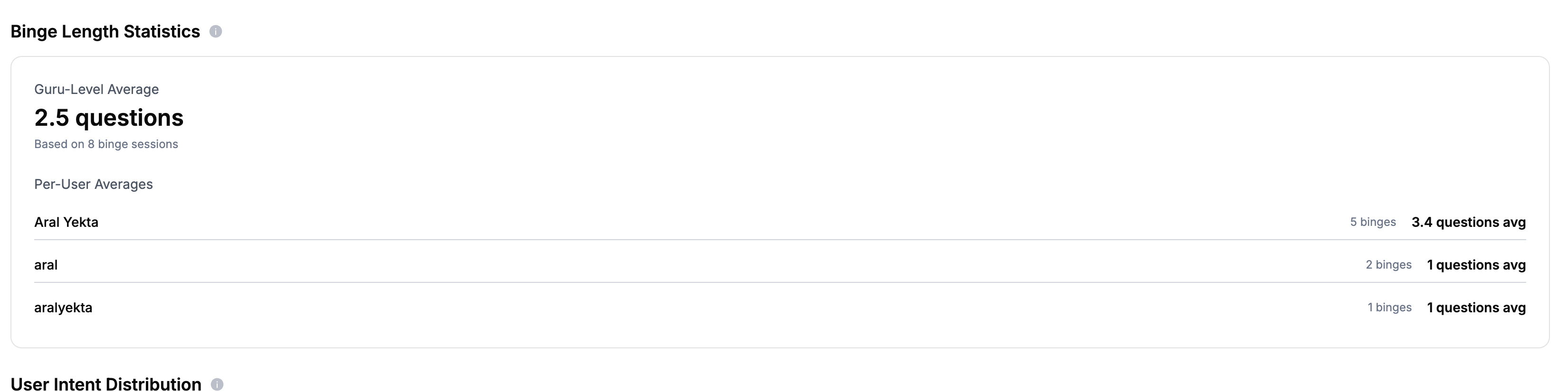
- Guru-Level Average: Overall average number of questions per session
- Per-User Averages: Individual user statistics showing how many binge sessions each user had and their average questions per session
12. User Intent Distribution
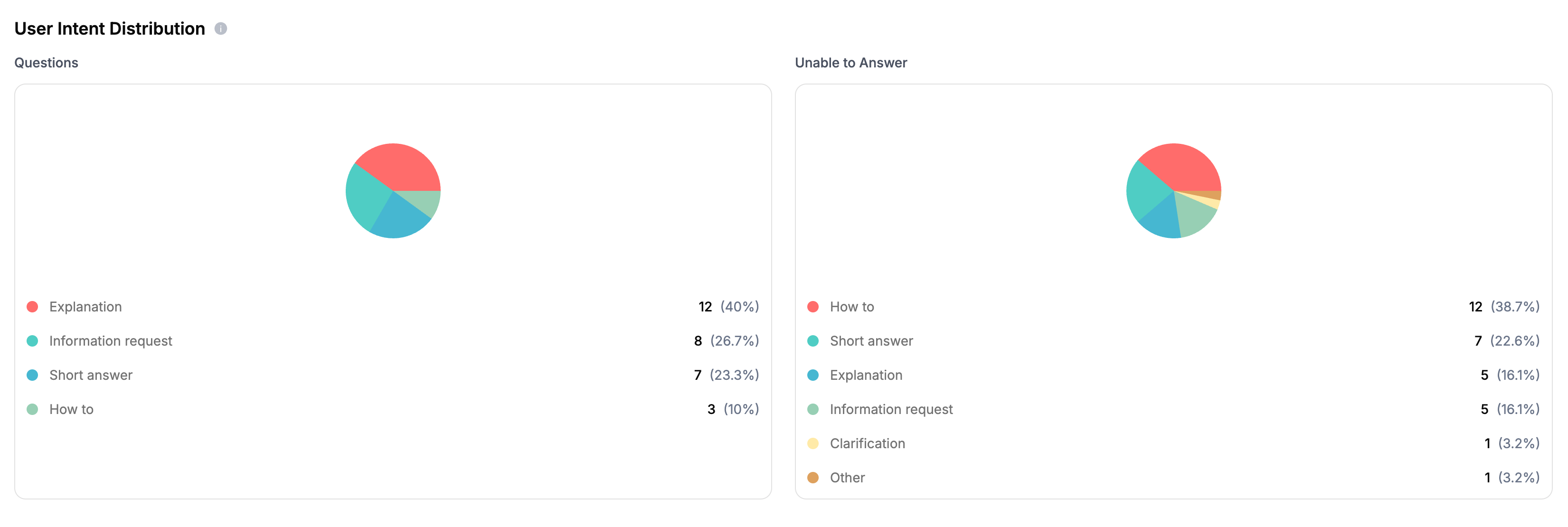
- Questions: Distribution of all questions by intent
- Unable to Answer: Distribution of unanswered questions by intent
- Short Answer: User wants a brief, concise answer
- Explanation: User wants detailed explanation of a concept
- How To: User wants step-by-step instructions
- Why: User wants to understand reasons or causes
- Comparison: User wants to compare different options
- Clarification: User needs clarification on something unclear
- Greeting: User is greeting or starting conversation
- Thanks: User is expressing gratitude
- Troubleshooting: User is trying to solve a problem
- Information Request: User wants specific information
- Other: Any other intent not covered above
13. Sentiment Analysis
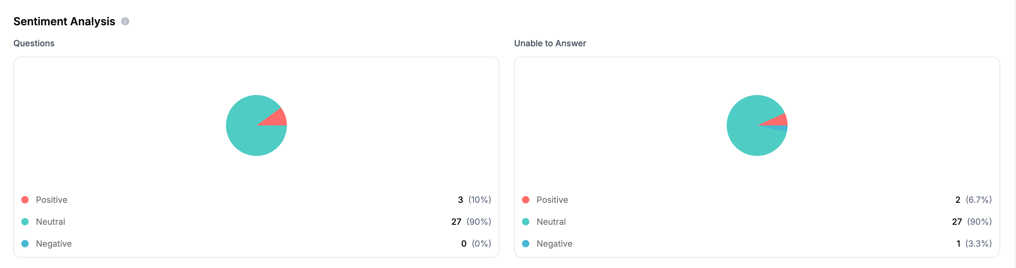
- Questions: Distribution of all questions by sentiment
- Unable to Answer: Distribution of unanswered questions by sentiment
- Positive
- Neutral
- Negative
Add Widget to Your Site
Learn how to embed your Guru on your website
Add GitHub Bot to Your Workspace
Learn how to add a GitHub bot to your repositories
Add Discord Bot to Your Server
Learn how to add a Discord bot to your server
API Integration
Integrate Guru with your applications